
Welcome to my Pixel Japanese Alphabets, the most recent side project that I’ve been working on. As a Product Designer (UI/UX) who loves to create enjoyable and engaging experiences, I want to create a platform that makes learning Japanese alphabets fun and easy. This project not only gives me the opportunity to sharpen my UX skills but more importantly, to wear the hat of a web developer for the first time.
Check out the project at www.emillionideas.com
Overview
Back in May, I started my first Japanese class and quickly fell in love with the language. Both Vietnamese (my mother tongue) and English (my second language) have their alphabets belonging to the Latin family. Therefore, learning how to write Japanese characters is something new and interesting to me.
Modern Japanese is written in a mixture of three basic writing systems: Hiragana and Katakana – the two phonetic alphabets, as well as Kanji – Chinese ideographic symbols. In the Pixel Japanese Alphabets project, my emphasis is on the kana (Hiragana & Katakana) systems. They have the same sounds, but the forms are different. Another difference is Katakana is mostly used for writing foreign words. Can you guess the meaning of チーズ (Chīzu)? Hint: this is a food item that belongs to the dairy group.
During the scope of the project, even though I encountered numerous challenges while working on the frontend development (there were some that left me sleepless a few nights), I gained a better understanding of what’s implementable and felt more confident in designer-developer collaboration. Next, I am excited to share with you my experience of wearing multiple hats, spanning UX, visual design and web development.
Wearing the UX Designer hat
Setting up the grid layout
Different from the Latin alphabet, Hiragana and Katakana characters go together in groups, either horizontally or vertically. Take Hiragana for example, in the first group, we’ll have あ (a), い (i),う (u), え (e), お (o). Second group, か(ka), き(ki), く(ku), け(ke), こ(ko). Third group, さ(sa), し(shi), す(su), せ(se), そ(so). Now, you see the pattern?
First of all, I set up a 5x10 grid. When a flashcard expands, it should push down others in the same column, rather than affecting the entire subsequent row. The reason behind it is that in the collapsed state, characters in the same group should stay on the same level. As flashcards expand, additional space is utilized.

Selecting the key components for a flashcard
After searching and not finding any alphabet chart that met my expectation, it became a motivation for me to build my own. It’s important that each flashcard should include these following fundamental elements:
- Character
- Stroke order
- Illustration
- Vocabulary (Japanese, Romaji, English)

1. Character
To start with, an alphabet chart couldn’t have its name without the characters. Both Hiragana and Katakana have the same number of basic characters which is 46. As mentioned above, they stay together in groups, the first of which contains 5 of the vowels あ (a), い (i),う (u), え (e), お (o). The following 40 characters are made of a consonant (or consonants) followed by a vowel, such as k + あ(a) = か(ka). Finally, we have the last character ん(n, sometimes m).
2. Stroke order
When I started with the first alphabet, Hiragana, I quickly learned that stroke order is very important to Japanese culture. I remember during writing practice, our Japanese teacher took time to make sure everyone wrote in the correct order, and would point out even the smallest errors. After a quick research, I discovered that according to the traditional art of calligraphy, following stroke order is the key to making beautiful characters. To put it into a word, I would say ‘tradition’ is the main reason why showing respect to stroke order is equivalent to honoring Japanese culture.

3. Illustration
When I was learning English growing up, my dad who was also my first teacher, not only taught me the fundamentals but also showed me how fun learning a language could be. Whether it was a letter game that was hosted by a cute cat named Ginger, or a ‘Where’s Wally?’ type of puzzle, I remember always feeling incredibly excited with those lessons that were filled with colorful and adorable illustrations. As a child I recall my dad often told me:
“Instead of my explaining the meaning of the word, which you may forget the next day, I can show you a picture of it, and the word will become friends with your memory.”
This personal experience brings me to the thought of “Why not learn languages like a child?”. In the colorful world of Pixel Japanese Alphabets, I hope that no matter what your age, you’ll find joy in visual learning.
4. Vocabulary
Finally, each word that goes with the corresponding character will be shown in Japanese, Romaji and English. Romaji is simply the Latin script used to help non-Japanese speakers pronounce the language. When you see ‘Tōkyō’ instead of ‘とうきょう’, you’re looking at Romaji.
Accessibility consideration
Design system
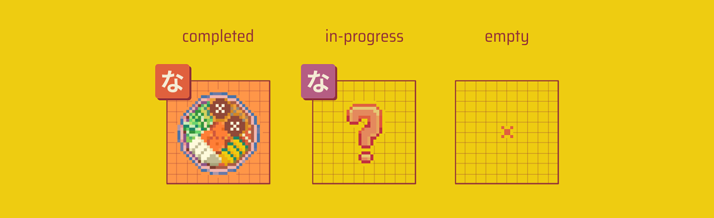
Given the structural similarities between Hiragana and Katakana, my approach involves keeping a design system in place to ensure that UI components with similar functionality remain consistent. For example, in the grid layout, each slot will be displayed in one of three states: completed, in-progress, or empty. Regardless of the alphabet in consideration, “completed” signifies that the flashcard contains all the required content, “in-progress” indicates that there’s additional work to be done, and “empty” means the space intentionally remains blank.
Color contrast
Transitioning from prototyping to development, I noticed that while the original color scheme meets my aesthetic preferences, the contrast of several text components falls short of accessibility standards. Therefore, I rechecked the text components to make sure the contrast between the text and background is greater or equal to 4.5:1.

Alternate text for images
As a millennial kid, helping my boomer family members with technology is not something I’m unfamiliar with. I have an aunt who has been suffering from cataracts for years. Prior to her receiving treatment, screen reader tools proved helpful, enabling her to continue using her devices. Hence, I aim to provide adequate descriptions for images that convey content, ensuring that screen reader users can understand them. Next, I conducted a fun experiment where I tried to navigate the website while blindfolded with the assistance of a screen reader extension. Owing to the test, I was able to pinpoint which description was unclear or wasn’t read correctly.
Wearing the Visual Designer hat
Pixel art
During a past project in August, my partner and I developed our first video game, Dino Dash. This marked the beginning of my pixel art journey, motivating me to seek more chances to create illustrations in this style. Thus, while constructing the first prototypes, I had to keep in mind that the goal was to establish a layout that harmonizes with the pixel art style.

Grid notebook
The idea of resembling the grid notebook look and feel came from my note-taking habit. Not long ago, I discovered Hobonichi (ほぼ日) Techno and became fond of it. This is a Japanese planner that is well-known for its minimal but functional design. In some ways, it is similar to a bullet journal but instead of bullets, there are grids. There’s a certain joy in jotting down goals, checking off tasks, and marking events in it. Organizing my daily life on a grid gives me a sense of order and accomplishment. That explains why I have a fascination with squares and find joy in working with them.
Wearing the Developer hat
Pixel Japanese Alphabet is the first web project where I am fully involved in the development stage. I have to admit the idea of coding an entire website from scratch used to intimidate me. For a while, my html and css knowledge was just enough for me to understand the basics and make minor adjustments if needed. I realize it has always been the boulder between my design and turning it into something functional.
Eventually, I decided to dig a hole next to that boulder and push it in, dusting off my hands. Luckily, the more I am familiar with html and css, the more I realize they are quite fun and friendly for designers to learn. Other than the daily challenge of centering a div, the rest is mostly being a good friend with flexbox and grid.
Design + Code
Wearing the developer hat allowed me to gain a deeper insight into the entire design process. Most importantly, I can see the extent of possibilities within my design project and get a sense of where things might get tricky down the road.
Reusable components
To minimize repetitive and lengthy html, I aimed to construct each alphabet from reusable components. That way I can easily recycle what I created for Hiragana when working on Katakana. For example, since both Hiragana and Katakana have the same amount of characters, I built one template that can be shared between those two, and only customized the data. This helped utilize the work flow and increase productivity.
What's next?
From here, my next goal is to continue working on the next alphabet-Katakana, along with implementing Javascript to enrich the experience with animation. All feedback is greatly appreciated to help improve this project. Until next time!
Check out the project at www.emillionideas.com


